

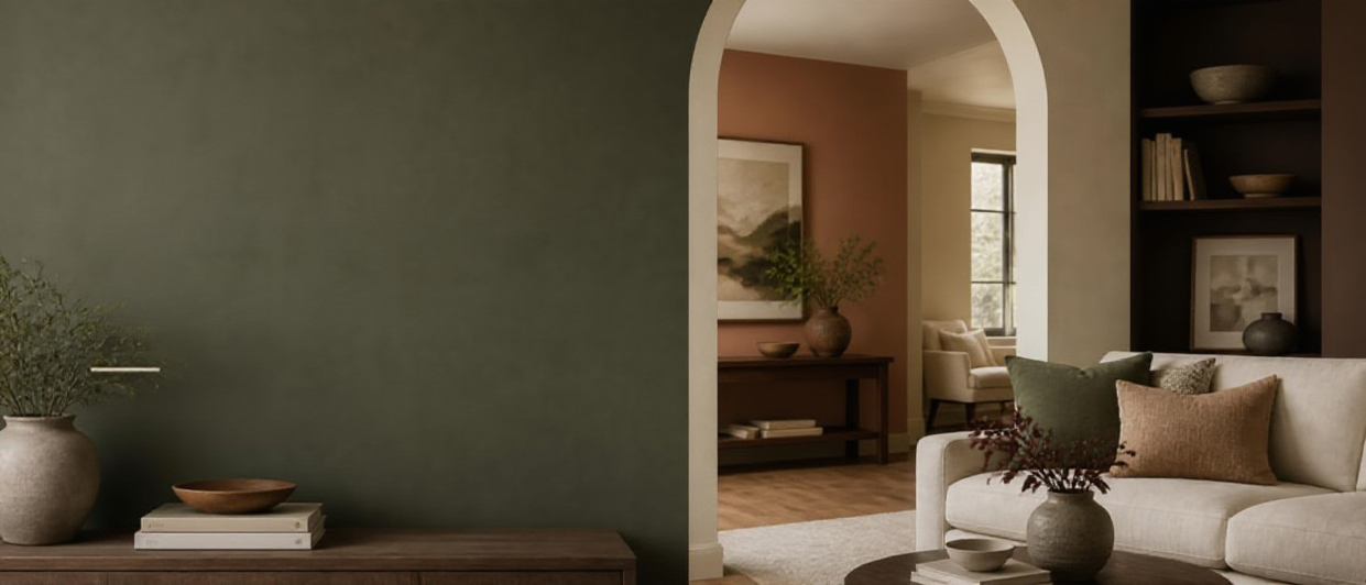
If you’re choosing 2026 paint colors, the big shift is toward grounded, livable shades: moody blue-greens, warm modern browns, upgraded neutrals, and softened pastels that still feel sophisticated.
This guide breaks down the paint colors trending for 2026 and shows where to use them—from offices and powder rooms to kitchen islands, bedrooms, hallways, nurseries, and even ceilings and millwork—so your paint choice looks intentional in real life (and in your lighting).
2026 Interior Paint Color Trends at a Glance (Colors + Best Rooms)
|
2026 paint color trend |
Overall vibe |
Best rooms + placements |
|
Smoky jade (deep blue-green) |
Moody, refined, nature-forward |
Office, dining room, powder room, bedroom, built-ins, kitchen island |
|
Espresso brown (charcoal-infused brown) |
Cozy-luxe, modern classic |
Living room, library-style office, entryway, guest room, doors, trim/millwork |
|
Warm greige (khaki/mushroom neutrals) |
Soft warmth, flexible backdrop |
Hallways, open-plan living, bedrooms, laundry room, ceilings, trim |
|
Dusty pastels (muted lilac/blue/sage/blush) |
Airy, calming, updated |
Nursery, bathroom, nook, guest room, ceilings, built-in shelving |
|
Sunbaked terracotta (clay/earthy red) |
Warm, artisanal, sunlit |
Entryway, dining room, kitchen accents, laundry room, powder room, feature walls |
|
Color-drenched rooms (walls + trim + ceiling) |
Immersive, design-forward |
Powder room, office, bedroom, hallway, reading nook; especially with millwork |
Design note — The most “on-trend” best paint colors for 2026 aren’t loud. They’re muted, complex, and flattering in changing daylight, which makes them easier to live with long-term.
1) Smoky Jade & Deep Blue-Green: The 2026 Paint Color That Acts Like a New Neutral
Deep blue-green paint colors—smoky jade, stormy teal, evergreen-leaning shades—are among the top 2026 interior paint color trends because they read calm and sophisticated while still giving you more depth than beige or white.
Where to use smoky jade / deep blue-green paint (best placements):
Home office — Paint all four walls for focus, or use it behind the desk to frame shelving and Pair with warm wood and brass for balance.
Powder room — Small rooms can take dramatic Add a mirror, sconce lighting, and warm metals for a boutique-hotel flnish.
Kitchen island — Paint the island (or lower cabinets) to create contrast without darkening the whole Looks especially good with cream uppers and light stone.
Bedroom — Try an accent wall behind the headboard for a cocooning look that still feels restful.
Millwork & built-ins — Bookcases, bar nooks, mudroom benches, and cabinetry look custom in a muted green-blue.
Quick tip — Blue-green undertones shift a lot. In north-facing rooms they can read cooler and moodier; in warm afternoon light they often look richer and greener.
2) Espresso Brown & Charcoal-Brown: The Cozy-Luxe 2026 Paint Color Trend
Brown is back, but the paint colors trending for 2026 are deeper and more tailored than old-school flat browns. Think espresso with a charcoal edge—warm, grounded, and surprisingly versatile with both modern and traditional furnishings.
Where to use espresso brown paint (best placements):
Living room — Use on a flreplace wall, built-ins, or a feature wall to add “collected” character and make art pop.
Entryway — A darker entry hides scuffs, feels intentional, and delivers an elevated flrst impression.
Guest room — One accent wall adds instant boutique-hotel Pair with crisp white bedding and soft, warm lighting.
Doors & trim (millwork) — Paint interior doors or trim in charcoal-brown for a designer contrast without committing to dark walls.
3) Warm Greige, Mushroom & Khaki Neutrals: The Best Background Paint Colors for 2026
If you’re searching for the best paint colors for 2026 that work almost anywhere, start with warm greige, mushroom, and khaki neutrals. They’re trending because they’re soft, flexible, and forgiving—warmer than cool gray, less yellow than classic beige.
Where warm greige neutrals work hardest (best placements):
Hallways — A warm mushroom neutral reduces the “tunnel effect” and transitions smoothly into multiple rooms.
Living room (open plan) — Ideal for Add texture—rugs, linen, wood—to keep it dimensional.
Laundry room — Makes utility spaces feel calm and clean, especially with white appliances and light tile.
Ceilings — Try a tinted ceiling (1–2 shades lighter than the wall color) for a soft, custom flnish without high contrast.
4) Dusty Pastels: Soft 2026 Paint Colors That Still Feel Grown-Up
Dusty pastels—muted lilac, misty blue, powdery sage, blush-beige—are rising in the 2026 interior paint color trends because they add gentle color without feeling juvenile. The key is choosing grayed-out, “cloudy” versions (not candy-bright tones).
Where to use dusty pastel paint (best placements):
Nursery — Keeps the room calm and timeless. Layer with natural wood and warm whites so it grows with your child.
Nook — Breakfast nooks and reading corners are perfect for a subtle pastel that feels playful but polished.
Guest room — Dusty blue or muted mauve reads relaxed and hotel-like with crisp bedding and warm bulbs.
Ceiling — A soft pastel ceiling can make a room feel taller and more flnished, especially in a bedroom or nursery.
5) Sunbaked Clay, Terracotta & Earthy Red: The Warmth-Boosting 2026 Paint Trend
Earthy reds are one of the most practical 2026 paint colors because they add warmth to cooler homes and pair beautifully with natural materials. Think sunbaked clay, muted terracotta, cinnamon, and brick dust—not bright red.
Where to use terracotta / earthy red paint (best placements):
Dining room — Clay tones flatter skin in warm light and make dinners feel cozy and intentional.
Kitchen accents — Use on a pantry door, banquette wall, or open-shelving back panel for a subtle statement.
Powder room — Terracotta looks incredible with warm metals, plaster textures, and high-contrast stone.
Entryway — Sunbaked tones feel welcoming and lively, especially with woven runners and natural wood.
6) Color Drenching: The Bold “Where to Use Them” Strategy for 2026 Paint Colors
Color drenching—painting walls, trim, doors, and sometimes the ceiling in the same color family—is one of the strongest paint colors trending for 2026 when you want an immersive, high-end look that still feels calm and livable (especially in spaces with angles, millwork, or multiple doorways).
Where color drenching works best (best placements):
Powder room — A fast, high-impact Go dark and dramatic (deep blue-green or espresso) for a jewel-box effect.
Office — Walls + trim + built-ins in one tone reduces visual clutter and looks intentional on video calls.
Bedroom — One enveloping shade creates a retreat (especially with layered textiles and warm bedside lighting).
Hallway — Turns a pass-through into a designed moment and smooths transitions between rooms.
Nook — The perfect place to test the trend without committing to a large open-plan space.
Pro move — For color drenching, keep the color consistent but vary the sheen (eggshell on walls, satin on trim). Same color, different flnish = depth without visual chaos.
Room-by-Room Guide: Best 2026 Paint Colors (and Exactly Where to Use Them)
Use this quick placement guide to match the most popular 2026 paint colors to the rooms you’re actually painting, so the trend looks intentional—not random.
|
Room |
Best paint colors for 2026 |
Where to use them |
Office |
Smoky jade; deep blue-green; espresso brown |
Color-drench for focus, or paint the wall behind the desk + built-ins. |
Powder room |
Deep blue-green; terracotta; espresso brown |
Go bold: walls + ceiling in one shade, then add warm metal and a statement mirror. |
Kitchen island |
Smoky jade; charcoal-brown; earthy red |
Island or lower cabinets only for contrast; keep uppers light for balance. |
Bedroom |
Deep blue-green; warm greige; dusty pastel |
Accent wall behind the headboard, or a tinted ceiling for a softer wraparound feel. |
Dining room |
Terracotta; deep blue-green; espresso brown |
Full-room color for drama; especially beautiful with dimmers and warm bulbs. |
Living room |
Warm greige; espresso brown; deep blue-green |
Greige on main walls; use espresso on built-ins or a fireplace wall for depth. |
Hallway |
Mushroom/greige; color-drenched deep tones |
Warm neutral for flow, or color-drench to turn the hallway into a design feature. |
Laundry room |
Warm greige; sunbaked clay; dusty blue |
Paint cabinets or the door for personality without making the room feel dark. |
Nursery |
Dusty pastels; warm greige |
Soft pastel on walls; consider a pastel ceiling for a gentle, dreamy look. |
Guest room |
Dusty pastel; espresso brown; warm greige |
One accent wall + cozy textiles; keep lighting warm to avoid a flat look. |
Entryway |
Terracotta; espresso brown; deep blue-green |
Paint doors and trim for durability; add a runner and art for warmth. |
Nook |
Dusty pastel; smoky jade; earthy red |
Wrap the nook in one color (including trim) to make it feel intentional. |
Ceilings & millwork |
Tinted greige; deep blue-green; espresso brown |
Tint the ceiling or paint trim/doors darker for a custom, modern contrast. |
Do this before you paint — Test with large swatches (poster-board size or peel-and-stick samples) and move them around the room. Check morning light, afternoon sun, and evening lamplight so you see the true undertone before buying gallons.
Quick Checklist: How to Test 2026 Paint Colors at Home
Test at least 2–3 shades in the same family (one lighter, one mid, one deeper).
Place swatches on multiple walls (especially near windows and in corners).
View next to flxed flnishes: flooring, countertops, tile, and large furniture.
Check the color beside your trim/ceiling white to conflrm the contrast feels right.
Decide your “hero moment” (island, powder room, built-ins, millwork) before painting an entire open plan.
FAQ: 2026 Paint Colors, Trends, and How to Choose the Right One
What paint colors are trending for 2026?
The most popular paint colors trending for 2026 include smoky jade and deep blue-greens, espresso/charcoal browns, warm greige and mushroom neutrals, dusty pastels, and sunbaked terracotta/earthy reds. These shades feel richer and warmer than the cool gray era, with undertones that look “designed” in real light.
What are the best paint colors for 2026 if I want something safe but current?
Choose a warm greige, mushroom, or soft khaki neutral for main walls—then add one trend color (like deep blue-green or espresso) on a kitchen island, powder room, or built-ins. It’s the easiest way to get the 2026 look without overcommitting.
Where should I use dark 2026 paint colors (like blue-green or espresso brown)?
Dark colors look best where you want depth: offices, powder rooms, dining rooms,
entryways, built-ins, and doors/trim. If you’re nervous, start with millwork (doors, trim, cabinets) or a single feature wall before color drenching an entire room.
How do I avoid paint regret with 2026 interior paint color trends?
Test large swatches and evaluate them across a full day. Many 2026 paint colors are intentionally complex, which means they can shift depending on exposure, bulbs, and nearby flnishes. When in doubt, choose the color you love in your worst lighting—not your best lighting.
Final Takeaway: The Best 2026 Paint Color Is the One That Works in Your Light
The smartest way to use 2026 paint colors is to match the trend to the room’s job: warm neutrals for flow, moody blue-greens for focus, espresso browns for cozy depth, dusty pastels for softness, and terracotta for warmth. Then place it strategically—an island, a powder room, built-ins, doors, or a tinted ceiling—so it feels intentional.
Test flrst, choose with confldence, and you’ll get a trend-forward result that still feels timeless in your home.


